Picture this: You’ve just captured the perfect photo for your website, but when you try to upload it, the file is too large. Or maybe you need to resize dozens of product images for your online store, and the thought of installing yet another piece of software makes you groan. Sound familiar?
In 2026, resizing images online for free has become easier than ever—no downloads, no subscriptions, and no compromising your privacy. Whether you’re preparing images for social media, optimizing photos for faster website loading, or simply reducing file sizes for email attachments, browser-based tools now handle everything instantly and securely.
This comprehensive guide walks through everything needed to resize images online for free in 2026 style—with privacy-first tools that run entirely in your browser, keeping files secure while delivering professional results in seconds.
Key Takeaways
✅ Browser-based image resizers process files locally, keeping photos private without server uploads
✅ Free online tools eliminate the need for expensive software like Photoshop for basic resizing tasks
✅ Proper image sizing dramatically improves website speed, user experience, and search engine rankings
✅ Batch resizing capabilities save hours when working with multiple images simultaneously
✅ Quality control settings let users balance file size reduction with visual clarity for different platforms
Why Resize Images Online in 2026?
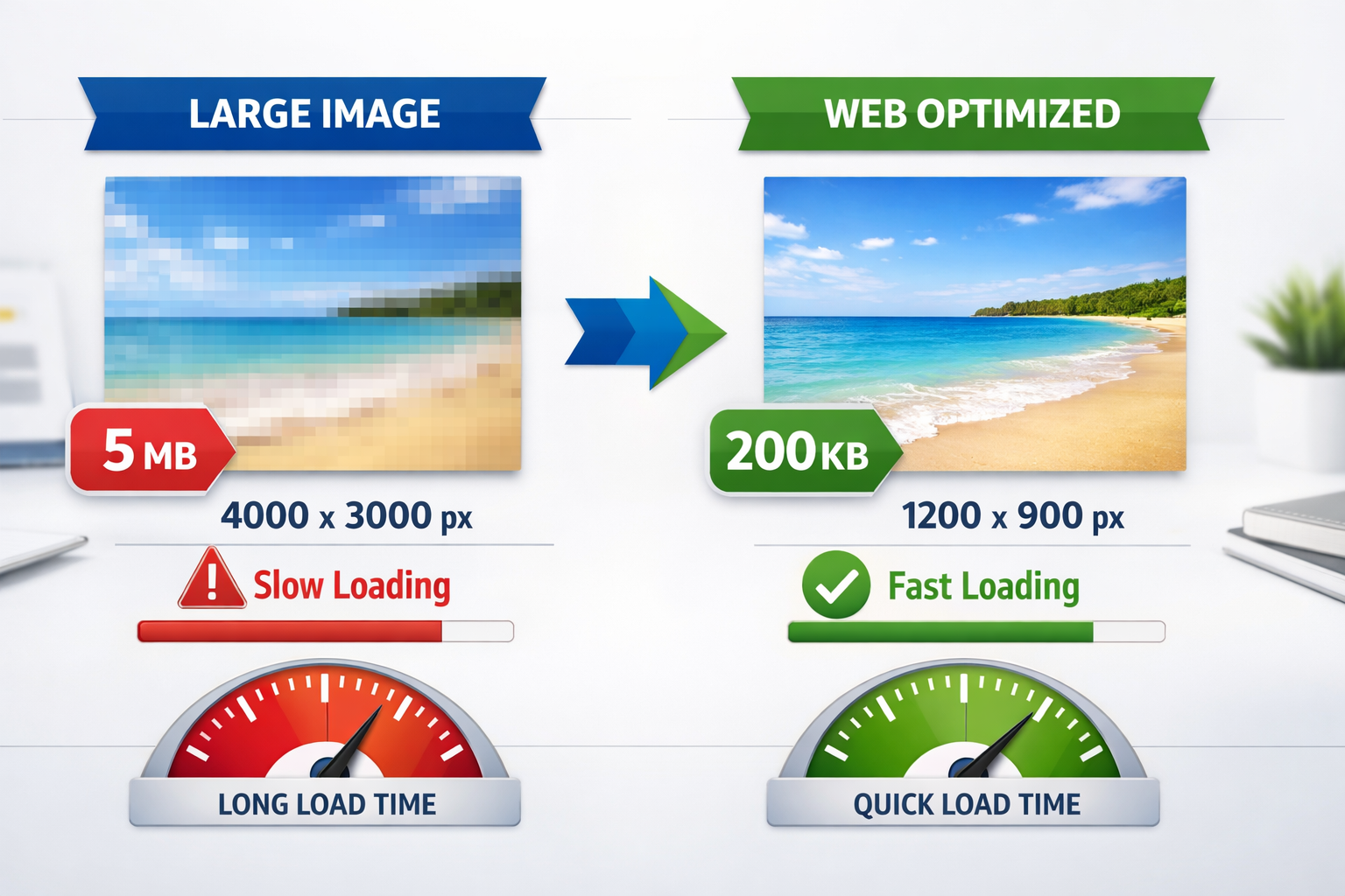
The digital landscape has evolved dramatically. Website visitors expect pages to load in under three seconds, social media platforms have specific dimension requirements, and email providers still impose attachment size limits[1]. Yet cameras and smartphones now capture images at resolutions far exceeding what most applications require—often 12 megapixels or more, resulting in file sizes of 5-10MB per photo.
The consequences of oversized images are real:
- Slow website performance: A single unoptimized 5MB hero image can delay page load by several seconds, driving visitors away
- Rejected uploads: Many platforms automatically reject files exceeding size limits
- Storage waste: Cloud storage fills up quickly with unnecessarily large files
- Poor user experience: Mobile users on limited data plans suffer when loading massive images
The Privacy Advantage of Browser-Based Tools
Traditional online image editors upload files to remote servers for processing. This approach raises legitimate privacy concerns—who has access to those photos? How long are they stored? Are they used for training AI models?
Privacy-first image resizers that run entirely in your browser elegantly solve this problem. All processing happens on the local device, meaning files never leave the computer. No uploads. No server storage. No privacy compromises. Just fast, clean results with complete control over personal images.
This approach particularly matters for:
- Business professionals handling confidential product photos or documents
- Photographers protecting unreleased client work
- Anyone who values digital privacy and data security
Understanding Image Dimensions and File Sizes
Before diving into the resizing process, understanding the relationship between dimensions, resolution, and file size helps achieve optimal results.
Key Terms Defined
Dimensions (Width × Height): Measured in pixels (px), these numbers describe the actual size of an image. A 1920×1080 image contains 1,920 pixels across and 1,080 pixels down.
Resolution (DPI/PPI): Dots per inch or pixels per inch measure print quality. Web images typically use 72 DPI, while print-ready photos need 300 DPI for crisp results.
File Size: Measured in kilobytes (KB) or megabytes (MB), this represents the storage space an image occupies. File size depends on dimensions, compression, and format.
Aspect Ratio: The proportional relationship between width and height (like 16:9 or 4:3). Maintaining aspect ratio prevents distortion when resizing.
Common Image Dimensions by Use Case
| Platform/Use | Recommended Dimensions | Aspect Ratio | Typical File Size Goal |
|---|---|---|---|
| Website hero image | 1920×1080 px | 16:9 | 200-500 KB |
| Blog post image | 1200×675 px | 16:9 | 100-300 KB |
| Instagram post | 1080×1080 px | 1:1 | 100-200 KB |
| Facebook cover | 820×312 px | 2.63:1 | 50-150 KB |
| Email attachment | 800×600 px | 4:3 | 50-200 KB |
| Thumbnail | 300×300 px | 1:1 | 10-50 KB |
| Print photo (4×6″) | 1800×1200 px | 3:2 | 2-5 MB |
These dimensions balance visual quality with performance. Going smaller sacrifices clarity; going larger wastes bandwidth without visible improvement on most screens.
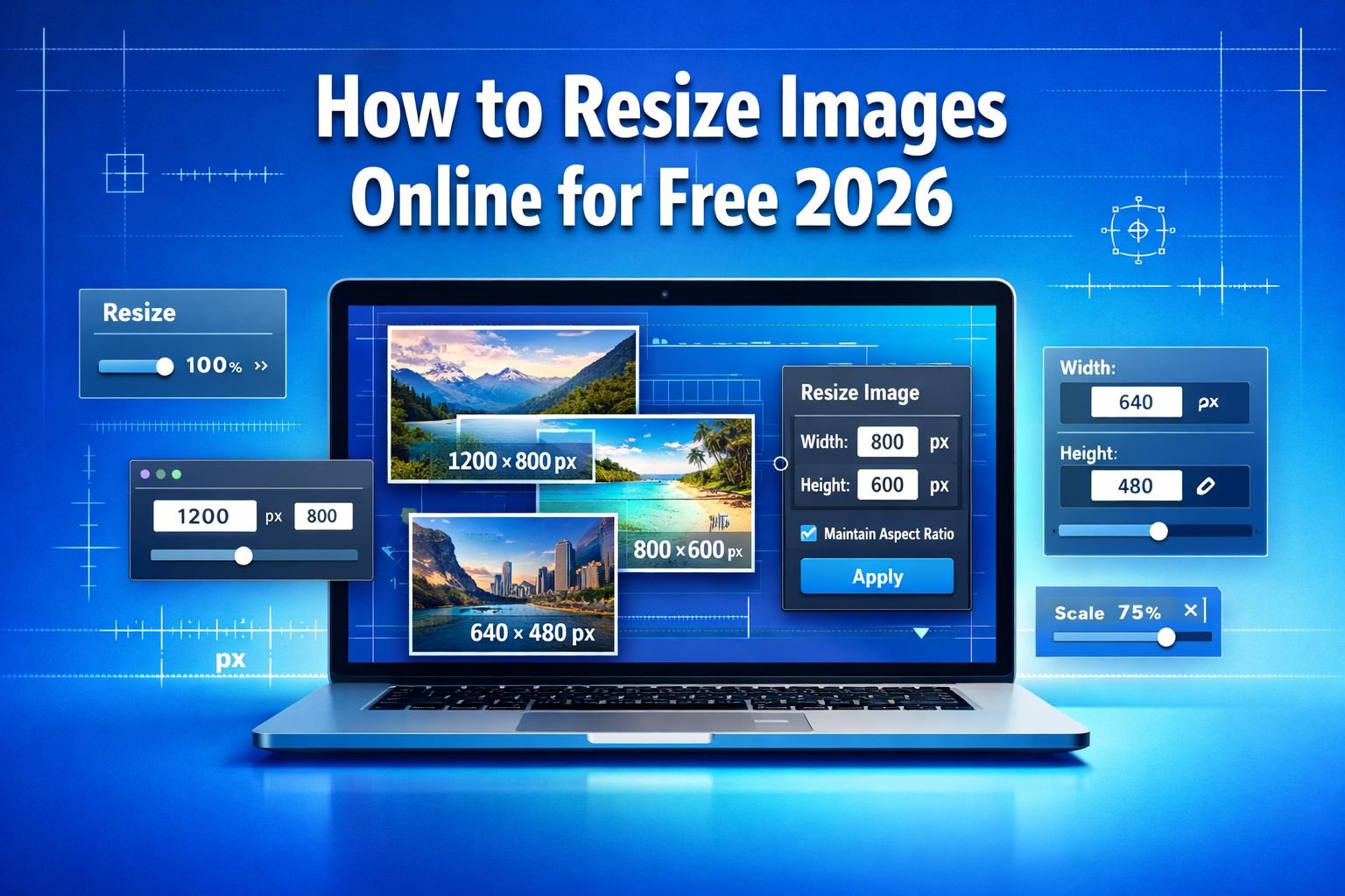
How to Resize Images Online Free 2026: Step-by-Step Guide
Ready to resize images? This straightforward process works with any privacy-first browser-based tool. The example uses CoreToolsHub’s image resizer, but the principles apply universally.
Step 1: Choose Your Image Resizer Tool
Navigate to a trusted online image resizer that prioritizes privacy. Look for these features:
✓ Browser-based processing (no server uploads)
✓ No signup required (instant access)
✓ Batch processing (resize multiple images simultaneously)
✓ Format support (JPG, PNG, WebP, HEIC)
✓ Quality controls (adjust compression levels)
CoreToolsHub’s Image Resizer checks all these boxes, processing files entirely in the browser while maintaining full quality control. Access it directly at the Image Resizer tool.
Step 2: Upload Your Image(s)
Most modern image resizers support multiple upload methods:
Drag and drop: Simply drag image files from a folder directly into the browser window. This method works beautifully for batch resizing—drop 10, 20, or even 50 images at once.
Click to browse: Click the upload area to open a file picker, then select one or multiple images from the device.
Paste from clipboard: Some tools accept images copied to the clipboard (Ctrl+V or Cmd+V).
🔒 Privacy note: With browser-based tools, files load directly into local memory. No upload progress bars, no waiting for server transfers—just instant access to resizing controls.
Step 3: Set Your Target Dimensions
This step determines the final image size. Several approaches work depending on needs:
Option A: Exact Dimensions
Enter specific width and height values in pixels. Example: 1200×800 for a blog post image.
⚠️ Common mistake: Entering dimensions without maintaining aspect ratio causes distortion. Always enable the “lock aspect ratio” or “constrain proportions” option unless you’re intentionally changing the image’s shape.
Option B: Percentage Scaling
Reduce by percentage (e.g., 50% of the original size). This method automatically maintains aspect ratio and works well when the exact final size doesn’t matter—just need something smaller.
Option C: Preset Dimensions
Many tools offer one-click presets for common platforms:
- Instagram Square (1080×1080)
- YouTube Thumbnail (1280×720)
- Facebook Post (1200×630)
- Email Safe (800×600)
Best practice: Start with platform-specific presets, then fine-tune if needed. These presets reflect current platform requirements as of 2026 and save time by eliminating manual dimension calculations.
Step 4: Adjust Quality Settings
Quality settings control compression—the balance between file size and visual clarity.
Quality slider (typically 1-100):
- 90-100%: Minimal compression, largest files, virtually no quality loss
- 80-90%: Sweet spot for most uses—significant file size reduction with negligible quality loss
- 70-80%: Noticeable compression in detailed areas, good for thumbnails
- Below 70%: Visible artifacts, only use for very small previews
💡 Recommended setting: Start at 85% quality. This typically reduces file size by 50-70% compared to maximum quality while maintaining a crisp, professional appearance. Adjust up or down based on results.
Format considerations:
- JPG: Best for photographs with many colors
- PNG: Best for graphics, logos, or images requiring transparency
- WebP: Modern format offering 25-35% better compression than JPG with equal quality (supported by all major browsers in 2026)
Step 5: Preview and Download
Before finalizing:
Preview the resized image: Zoom in to check for unwanted blur or compression artifacts, especially in detailed areas like text, faces, or fine patterns.
Check file size: Confirm the new file size meets requirements (email limits, website optimization goals, etc.).
Compare before/after: Some tools show side-by-side comparisons. Look for any unexpected changes in color, brightness, or sharpness.
Satisfied with the results? Click Download to save the resized image to the device. With batch processing, download all resized images as a ZIP file for convenience.
⚡ Speed note: Browser-based tools process images in seconds, even on modest hardware. A typical 5MB photo resizes to web-optimized dimensions in under two seconds—no waiting, no progress bars.
Top Features to Look for in Free Image Resizers
Not all online image resizers deliver the same experience. When choosing a tool to resize images online for free in 2026 style, prioritize these features:
1. True Browser-Based Processing
Why it matters: Privacy and speed. Tools that process files locally never send images to external servers, eliminating privacy risks and upload delays.
How to verify: Check if the tool works without an internet connection after the page loads. True browser-based tools continue functioning offline.
2. Batch Resizing Capabilities
Why it matters: Time savings. Resizing images one by one can become tedious when working with dozens of photos.
What to look for: Support for uploading and processing multiple images simultaneously, with consistent settings applied to all files.
Real-world example: A small business owner photographed 40 products for an online store. Using batch resize, all images were optimized to 1000×1000 pixels at 85% quality in under 60 seconds—a task that would have taken 30+ minutes manually.
3. Aspect Ratio Lock
Why it matters: Prevents distortion. Changing width without proportionally adjusting height creates stretched or squashed images that look unprofessional.
Best practice: Always enable aspect ratio lock unless intentionally cropping to a new shape (like converting a landscape photo to a square Instagram post).
4. Format Conversion
Why it matters: Versatility. Sometimes resizing also requires changing formats—converting HEIC iPhone photos to JPG for compatibility, or PNG graphics to WebP for better web performance.
Look for: One-step resize and format conversion, eliminating the need for separate tools.
5. No Artificial Limits
Why it matters: Flexibility. Some “free” tools impose restrictions such as watermarks, maximum file sizes, or daily usage limits that force users to upgrade to paid plans.
Red flags: Required account creation, “pro” features for basic functions, or watermarks on output images.
CoreToolsHub approach: Genuinely free with no signup required, no watermarks, and no artificial restrictions—just fast, clean results for any number of images.
How CoreToolsHub’s Image Resizer Stands Out
Among the many free online image resizers in 2026, CoreToolsHub’s image resizer delivers a privacy-first, no-nonsense experience designed for real-world use.
Complete Privacy Protection
All processing happens in the browser. Images never touch external servers. This isn’t marketing language—it’s architectural design. The tool operates entirely on the client side, meaning files remain on the local device throughout the process.
What this means practically:
- Confidential business photos stay confidential
- Personal images remain private
- No data collection or tracking
- Works offline after initial page load
No Installation, No Signup
Access the tool instantly at Core Tools Hub Image Resizer. No software downloads. No account creation. No email verification. Just open the page and start resizing.
This approach respects time and privacy—no barriers between needing to resize an image and actually doing it.
Intuitive Interface
The interface follows a simple, predictable flow:
- Upload (drag, drop, or browse)
- Set dimensions (exact pixels, percentage, or presets)
- Adjust quality (single slider)
- Download (individual files or ZIP)
No hidden menus. No confusing options. No learning curve. First-time users accomplish their goals in under a minute.
Batch Processing Power
Upload 50 images, set the dimensions once, and resize all at once. The tool applies consistent settings across all files, ensuring uniform sizing for product galleries, photo albums, or social media posts.
Time savings example: Resizing 30 vacation photos from 8MB each to web-friendly 200KB versions takes approximately 45 seconds total—compared to 15+ minutes using traditional desktop software that processes one file at a time.
Cross-Device Compatibility
Works on desktop and mobile devices. The responsive interface adapts to screen size, making it equally functional on a laptop, tablet, or smartphone.
Mobile use case: Resize photos directly on a phone before uploading to social media, avoiding the “upload then wait” delay of oversized images.
Related Tools Integration
Need more than resizing? CoreToolsHub offers a complete suite of privacy-first file tools:
- Image Compressor: Reduce file size without changing dimensions
- PNG to WebP Converter: Convert to modern formats for better web performance
- WebP to PNG Converter: Convert back for compatibility with older systems
- HEIC Converter: Transform iPhone photos to a universal format
All tools share the same privacy-first, browser-based architecture—no uploads, no tracking, no compromises.
Best Practices for Resizing Images for Web and Social Media
Knowing how to resize images is just the beginning. Following these best practices ensures optimal results for different platforms and purposes.
1. Start with High-Quality Source Images
The principle: Resizing down maintains quality; resizing up creates blur.
Always begin with the highest quality source image available. It’s easy to make a 4000×3000 photo smaller while maintaining clarity, but impossible to enlarge a 500×375 image to 2000×1500 without significant quality loss.
Practical tip: When photographing content, use the highest resolution camera settings. Storage is cheap; pixelated images on a website are expensive (in terms of lost credibility and conversions).
2. Match Dimensions to Platform Requirements
Each platform has optimal dimensions for the best display quality. Using incorrect sizes results in automatic cropping, stretching, or reduced quality on the platform.
Updated 2026 social media dimensions:
| Platform | Content Type | Optimal Size | Aspect Ratio |
|---|---|---|---|
| Feed post | 1080×1080 px | 1:1 | |
| Story | 1080×1920 px | 9:16 | |
| Post image | 1200×630 px | 1.91:1 | |
| Cover photo | 820×312 px | 2.7:1 | |
| Twitter/X | Post image | 1200×675 px | 16:9 |
| Post image | 1200×627 px | 1.91:1 | |
| Pin | 1000×1500 px | 2:3 | |
| YouTube | Thumbnail | 1280×720 px | 16:9 |
Website-specific recommendations:
- Hero images: 1920×1080 px (full-width banners)
- Blog post images: 1200×675 px (readable but not overwhelming)
- Product photos: 1000×1000 px (square for consistency)
- Thumbnails: 300×300 px (gallery previews)
3. Optimize File Size Without Sacrificing Quality
The goal: smallest possible file size while maintaining visual quality.
Target file sizes by use:
- Hero images: 200-500 KB
- Blog post images: 100-300 KB
- Social media posts: 100-200 KB
- Thumbnails: 10-50 KB
How to achieve these targets:
- Resize dimensions first: A 4000×3000 image at 100% quality might be 8MB. Resize to 1200×900, and the file size drops to ~2MB before any compression.
- Apply appropriate compression: Adjust the quality slider to 80-85% for another 50-70% file size reduction.
- Choose optimal format: WebP format typically produces 25-35% smaller files than JPG at equivalent quality[2].
- Test results: Always preview resized images at actual display size. If quality looks good, the optimization succeeded.
4. Maintain Aspect Ratio (Usually)
Changing the aspect ratio without cropping results in distorted, unprofessional-looking images. People look stretched, circles become ovals, and text appears compressed.
When to maintain aspect ratio: 95% of the time. Lock aspect ratio and adjust only one dimension—the other adjusts automatically.
When to change aspect ratio: When intentionally recomposing an image for a different format. Example: Converting a 16:9 landscape photo to a 1:1 square for Instagram. In this case, use a crop tool first to select the best square portion, then resize to the target dimensions.
5. Use Descriptive File Names
Before uploading resized images to websites or social platforms, rename files descriptively.
Bad: IMG_2847.jpg
Good: blue-running-shoes-product-photo.jpg
Descriptive file names improve SEO (search engines read file names), help with organization, and make future file management easier.
Naming best practices:
- Use lowercase letters
- Separate words with hyphens (not underscores or spaces)
- Include relevant keywords
- Keep names concise but descriptive
6. Test on Multiple Devices
Images that look perfect on a desktop monitor might appear differently on mobile devices due to differences in screen size, resolution, and color calibration.
Quick testing process:
- View resized images on the device used for editing
- Send to a smartphone and check the appearance
- If possible, test on both iOS and Android devices
- Verify images display correctly in both light and dark modes
This testing catches issues before images go live, saving embarrassment and rework.
Common Mistakes When Resizing Images (And How to Avoid Them)
Even with straightforward tools, certain mistakes keep cropping up. Recognizing these pitfalls helps avoid frustration and poor results.
Mistake #1: Ignoring Aspect Ratio
The problem: Entering new dimensions without maintaining proportions creates stretched or squashed images.
Example: Taking a 2000×1500 photo (4:3 ratio) and resizing to 1000×1000 (1:1 ratio) without cropping. The result: a distorted image with compressed width or stretched height.
The fix: Always enable “lock aspect ratio” or “constrain proportions.” If a different aspect ratio is needed, crop first, then resize.
Mistake #2: Over-Compressing Images
The problem: Setting quality too low (below 70%) to achieve tiny file sizes, resulting in visible compression artifacts—blocky areas, color banding, and loss of detail.
The fix: Start at 85% quality. Only reduce further if file size requirements demand it, and always preview results before finalizing. Remember: a slightly larger, professional-looking file beats a tiny, terrible one.
Mistake #3: Resizing Up Instead of Down
The problem: Trying to enlarge a small image to larger dimensions. This creates blurry, pixelated results because the software invents pixels that don’t exist in the original.
Example: Taking a 500×500 thumbnail and resizing to 2000×2000 for a banner. The result looks fuzzy and unprofessional.
The fix: Always start with the highest resolution source image available. If the source is too small, find or create a higher-resolution version rather than enlarging it.
Mistake #4: Using the Wrong Format for Content Type
The problem: Using PNG for photographs (unnecessarily large files) or JPG for graphics with text (compression artifacts around letters).
The fix:
- Photographs: Use JPG or WebP
- Graphics, logos, text: Use PNG (supports transparency and sharp edges)
- Animations: Use GIF or modern alternatives like animated WebP
- Modern websites: Use WebP when browser support allows (all major browsers in 2026)
Mistake #5: Forgetting Mobile Optimization
The problem: Optimizing images only for desktop viewing, resulting in oversized files that slow mobile page loads and consume data plans.
The fix: Test all images on mobile devices. Consider creating multiple versions (desktop and mobile) for very large images, using responsive image techniques to serve appropriately-sized versions to different devices.
Mistake #6: Skipping the Preview Step
The problem: Downloading and using resized images without checking quality, only to discover issues after publishing.
The fix: Always preview resized images at 100% zoom before downloading. Check:
- Overall clarity and sharpness
- Text readability (if image contains text)
- Color accuracy
- File size meets requirements
- No unexpected cropping or distortion
This 10-second check prevents redoing work later.
Advanced Tips for Power Users
Once comfortable with basic resizing, these advanced techniques unlock additional efficiency and quality improvements.
Batch Processing with Consistent Settings
When resizing multiple images for the same purpose (like a product gallery), batch processing saves significant time.
Workflow:
- Determine optimal dimensions and quality settings using one test image
- Upload all images simultaneously to the batch resizer
- Apply the tested settings to all images at once
- Download as a ZIP file
Time savings: Resizing 50 images individually might take 20-30 minutes. Batch processing completes the same task in under 2 minutes.
Creating Multiple Versions Simultaneously
Some scenarios require the same image at different sizes—like a blog post image that needs a full-size version (1200×675), a thumbnail (300×169), and a social share version (1200×630).
Efficient approach:
- Resize the original to the largest needed version first
- Use that resized version as the source for smaller versions
- This maintains quality better than resizing all versions from a massive original
Alternatively, use batch processing, uploading the original image three times and applying different dimension presets to each.
Optimizing for Retina/High-DPI Displays
Modern devices feature high-pixel-density screens (Retina displays, 4K monitors) that display images at 2× or 3× resolution for crisp appearance.
Strategy: Create images at 2× the display size, then let the browser scale down.
Example: For a 600×400 display area, create a 1200×800 image. The browser displays it at 600×400 but uses the extra pixels for sharper rendering on high-DPI screens.
Balance: This approach increases file size, so use appropriate compression (80-85% quality) to keep files manageable.
Using WebP for Maximum Efficiency
WebP format, now universally supported by major browsers in 2026, offers superior compression compared to JPG and PNG[2].
Benefits:
- 25-35% smaller files than JPG at equivalent quality
- Supports transparency (like PNG)
- Supports animation (like GIF)
When to use: For all website images when possible. Keep JPG versions as fallbacks only if supporting very old browsers.
Conversion workflow: Resize to target dimensions first, then convert to WebP format. Many modern image resizers, including CoreToolsHub, handle both steps simultaneously.
Automating Repetitive Tasks
For users who regularly resize images with identical settings, creating a documented workflow saves time:
Example workflow document:
Product Photos - Standard Process
1. Original dimensions: Any
2. Target dimensions: 1000×1000 px
3. Quality: 85%
4. Format: WebP
5. Naming: product-name-descriptive-keyword.webp
Keep this reference handy for consistent results across projects.
Troubleshooting Common Image Resizing Issues
Even with the best tools, occasional issues arise. Here’s how to diagnose and fix common problems.
Issue: Resized Image Looks Blurry
Possible causes:
- Quality setting is too low
- Resizing up from a small original
- Excessive compression
Solutions:
- Increase quality slider to 85-90%
- Start with a higher-resolution source image
- If the original is sharp but the resized version isn’t, try a different tool—some use better resizing algorithms
Issue: File Size Still Too Large
Possible causes:
- Dimensions still too large for intended use
- The quality setting is too high
- Using PNG when JPG would work better
Solutions:
- Reduce dimensions further (does the image really need to be 2000px wide?)
- Lower the quality to 75-80% and check if the visual quality remains acceptable
- Convert PNG to JPG or WebP for photographs
- Remove metadata (EXIF data), which some cameras embed in files
Issue: Colors Look Different After Resizing
Possible causes:
- Color profile conversion during processing
- Different display calibration on the viewing device
- Format conversion (PNG to JPG) is affecting color rendering
Solutions:
- Use the same format as the original (PNG to PNG, JPG to JPG)
- Check images on multiple devices to determine if the issue is display-specific
- For critical color accuracy, use professional tools that preserve color profiles
Issue: Image Appears Stretched or Squashed
Cause: Aspect ratio wasn’t maintained during resizing.
Solution:
- Always enable “lock aspect ratio” or “constrain proportions”
- If a different aspect ratio is needed, crop the image first to the desired shape, then resize
Issue: Transparent Background Becomes White or Black
Cause: Converting PNG with transparency to JPG (which doesn’t support transparency).
Solution:
- Keep transparent images in PNG or WebP format
- If JPG is required, add a background color before converting
Issue: Tool Won’t Accept File
Possible causes:
- File format not supported
- File corrupted
- File size exceeds browser memory limits
Solutions:
- Convert to a standard format (JPG or PNG) first
- Try opening and re-saving the file in an image viewer
- For extremely large files (>50MB), compress first before resizing
The Future of Image Optimization in 2026 and Beyond
Image technology continues evolving rapidly. Understanding emerging trends helps future-proof workflows.
AI-Powered Upscaling
While traditional resizing up creates blur, AI-powered upscaling algorithms now intelligently add detail when enlarging images. These tools analyze image content and generate realistic pixels rather than simply interpolating existing ones.
Current state (2026): Available in some advanced tools, though processing is slower than standard resizing.
Practical use: Converting lower-resolution source images to higher resolutions when originals aren’t available.
Next-Generation Formats
WebP gained widespread adoption, but newer formats continue emerging:
AVIF: Offers even better compression than WebP (up to 50% smaller files) with broad browser support as of 2026[3].
JPEG XL: Designed as the ultimate successor to JPG, supporting both lossy and lossless compression with excellent quality.
Recommendation: Stick with WebP for now (universal support, excellent compression), but monitor AVIF adoption for future optimization opportunities.
Automated Responsive Images
Modern web development increasingly uses responsive image techniques—serving different image sizes to different devices automatically.
How it works: Upload one high-resolution image, and the system automatically generates and serves multiple sizes (thumbnail, mobile, tablet, desktop) based on the viewing device.
Benefit: Optimal performance without manual creation of multiple versions.
Current availability: Built into most modern content management systems and website builders.
Privacy-First Tools Becoming Standard
As data privacy concerns grow, browser-based processing is becoming the expected standard rather than a premium feature. Users increasingly demand tools that process files locally, without uploading to the server.
Industry trend: Major software companies are adding browser-based capabilities to existing tools, validating the privacy-first approach pioneered by services like CoreToolsHub.
Frequently Asked Questions
Q: Is resizing the same as compressing?
A: No. Resizing changes dimensions (width and height in pixels). Compressing reduces file size by removing data while keeping dimensions the same. Often, both are used together for optimal results—resize to the appropriate dimensions, then compress to further reduce file size.
Q: Will resizing images reduce quality?
A: Resizing down (making images smaller) typically maintains quality well, especially with modern algorithms. Resizing up (enlarging) always reduces quality because pixels must be invented. Quality settings during compression have a greater impact on visual quality than changes in dimensions.
Q: Can I resize images on my phone?
A: Yes. Browser-based image resizers work on mobile devices just as well as desktop computers. Visit the tool’s website, upload images, adjust settings, and download—all from a smartphone or tablet.
Q: What’s the best format for web images?
A: WebP offers the best combination of quality and file size for most web images in 2026. It’s supported by all major browsers and produces 25-35% smaller files than JPG at equivalent quality. For older browser compatibility, JPG remains a reliable fallback.
Q: How small should I make images for websites?
A: Target dimensions based on display size:
- Full-width hero images: 1920×1080 px
- Blog post images: 1200×675 px
- Thumbnails: 300×300 px
Target file sizes: 100-500 KB, depending on image size and importance. Larger hero images can be 500 KB; smaller inline images should stay under 200 KB.
Q: Do free image resizers add watermarks?
A: Some do, but quality tools like CoreToolsHub don’t. Always check before using a tool—truly free services won’t watermark output images or impose artificial restrictions.
Q: Can I batch resize hundreds of images at once?
A: Most browser-based tools handle 20-50 images simultaneously without issues. For hundreds of images, process in batches of 50 to avoid browser memory limitations. Desktop software may handle larger batches more efficiently for very large projects.
Conclusion: Resize Images Online Free 2026 with Confidence
Resizing images no longer requires expensive software, technical expertise, or privacy compromises. Modern browser-based tools deliver professional results in seconds—all while keeping files completely private and secure on local devices.
The key takeaways for successfully resizing images online in 2026:
✅ Choose privacy-first tools that process files in the browser without server uploads
✅ Match dimensions to platform requirements for optimal display and performance
✅ Balance quality and file size using 80-85% quality settings for most uses
✅ Maintain aspect ratio to prevent distortion (unless intentionally cropping)
✅ Batch process when possible to save time on multiple images
✅ Preview before downloading to catch issues early
✅ Use modern formats like WebP for better compression and faster loading
Whether preparing images for a website, optimizing photos for social media, reducing file sizes for email, or creating thumbnails for a gallery, the process is straightforward: upload, set dimensions, adjust quality, and download. No installation, no signup, no compromises.
Ready to Resize Your Images?
Try CoreToolsHub’s Image Resizer for fast, private, browser-based image resizing with no signup required. Process files securely on your device, maintain full quality control, and get clean results in seconds.
Need additional image tools? Explore the complete suite:
- Compress images without changing dimensions
- Convert to WebP for better web performance
- Convert HEIC to JPG/PNG for universal compatibility
All tools share the same privacy-first approach—your files, your device, your control.