Last updated: March 10, 2026
Key Takeaways
- Resizing an image to the wrong dimensions or exporting at the wrong format is the most common reason images look blurry or load slowly on websites and social media.
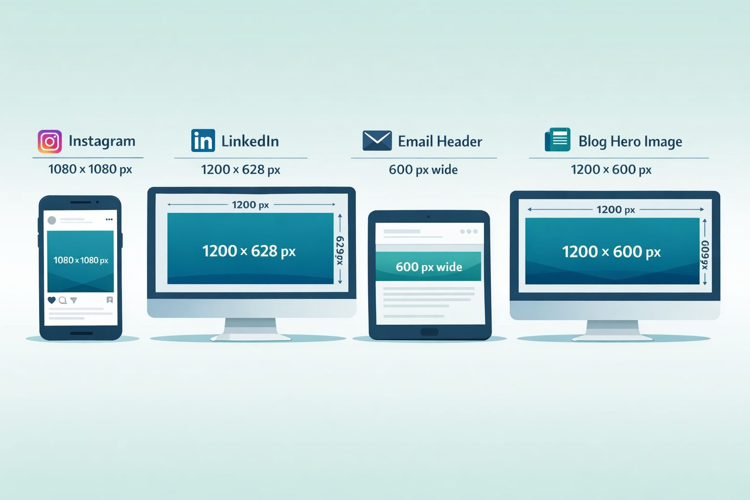
- Different platforms need different pixel dimensions: 1200px wide for blog heroes, 1080×1080px for Instagram, 1200×628px for LinkedIn posts, and 600px wide for email.
- WebP files are typically up to 30% smaller than JPG at comparable visual quality, and every major browser supports WebP as of 2026.
- Browser-based tools like the Core Tools Hub Image Resizer process your files locally — no uploads, no account needed, and your images stay private.
- Resizing and converting to a different format in one step (for example, resizing a PNG and saving it as WebP) is the fastest way to get smaller, sharper images for the web.
Quick Answer
To resize an image online without losing quality, open a browser-based resizer, enter the exact pixel width and height for your target platform, lock the aspect ratio, and export in the right format (WebP for web, JPG for photos, PNG for graphics with transparency). For most web images, 1200px wide at 80–85% quality in WebP gives sharp results at a fraction of the original file size. No software installation or account is required when using a client-side tool.
Why Do Resized Images Look Blurry or Pixelated?
Blurry images after resizing almost always come from one of three causes: scaling up a small image beyond its original resolution, exporting at a too-low quality setting, or saving in the wrong format for the use case.
When you enlarge a 400×400px image to 1200×1200px, the software has to invent pixel data that wasn’t there. The result is a soft, blurry image. No resizing tool — browser-based or desktop — can add real detail that never existed. This is called “upscaling,” and it has hard limits unless you’re using AI-powered tools like ON1 Resize AI, which can produce reasonable results up to several times the original size.
Shrinking an image (downscaling) is the opposite: you’re removing pixels, not inventing them. Done correctly, downscaling produces sharp, clean results. Most quality problems with downscaled images come from:
- Saving at low quality (below 70% for JPG, for example)
- Choosing the wrong format (JPG for a logo with transparency, or PNG for a large photo)
- Not locking the aspect ratio, which stretches or squishes the image
Common mistake: Many users resize inside Canva or Google Slides by dragging a corner, which changes dimensions without controlling the actual pixel output or file format. Always resize using a dedicated image tool when you need precise control.
What Are the Right Image Sizes for Web, Social, and Email?
Use these pixel dimensions as your starting point. They’re based on the current recommended specs for each platform as of 2026.
Web and Blog Images
| Use Case | Recommended Width | Format | Notes |
|---|---|---|---|
| Blog hero image | 1200px | WebP or JPG | Keep file under 200KB |
| In-article image | 800px | WebP or JPG | Compress after resizing |
| Product thumbnail | 400–600px | WebP or JPG | Square or 4:3 ratio |
| Logo / icon | 200–400px | PNG or SVG | Use PNG for transparency |
Social Media Image Sizes (2026)
| Platform | Dimensions | Format |
|---|---|---|
| Instagram feed (square) | 1080×1080px | JPG or WebP |
| Instagram story / reel | 1080×1920px | JPG |
| Facebook post | 1200×630px | JPG or WebP |
| LinkedIn post image | 1200×628px | JPG or WebP |
| LinkedIn profile banner | 1584×396px | JPG |
| X (Twitter) post image | 1200×675px | JPG or WebP |
| Pinterest pin | 1000×1500px | JPG or WebP |
| YouTube thumbnail | 1280×720px | JPG |
Email Images
- Header image: 600px wide (max), JPG or PNG
- Inline images: 400–600px wide
- Keep the total email image weight under 1MB to avoid clipping in Gmail
Quick tip: If you’re unsure which size to use, start with 1200px wide. It works for most blog posts, social shares, and email headers without looking stretched on any screen.
Understanding Resolution, DPI, and File Size (Without the Jargon)
Here’s the short version: for screens, DPI doesn’t matter. For print, it does.
Pixel dimensions (width × height in pixels) control how large an image appears on screen. A 1200×800px image is 1200 pixels wide regardless of DPI.
DPI (dots per inch) or PPI (pixels per inch) is a print concept. It tells a printer how densely to pack pixels on paper. For web and social media, the DPI value embedded in an image file is irrelevant — browsers ignore it and render based only on pixel dimensions.
- 72 DPI: Standard for web images (the number is essentially a label, not a quality setting)
- 150–300 DPI: Needed for print (business cards, flyers, posters)
File size is separate from pixel dimensions. Two images can be 1200×800px but have very different file sizes depending on the format (JPG vs. PNG vs. WebP) and the compression level applied.
Practical targets:
| Image type | Max file size goal |
|---|---|
| Blog hero image | Under 200KB |
| Social media post | Under 500KB |
| Email inline image | Under 150KB |
| Product page image | Under 100KB |
If your image is larger than these targets after resizing, run it through a compressor. The Core Tools Hub Image Compressor handles JPG, PNG, and WebP files directly in your browser with no uploads required.
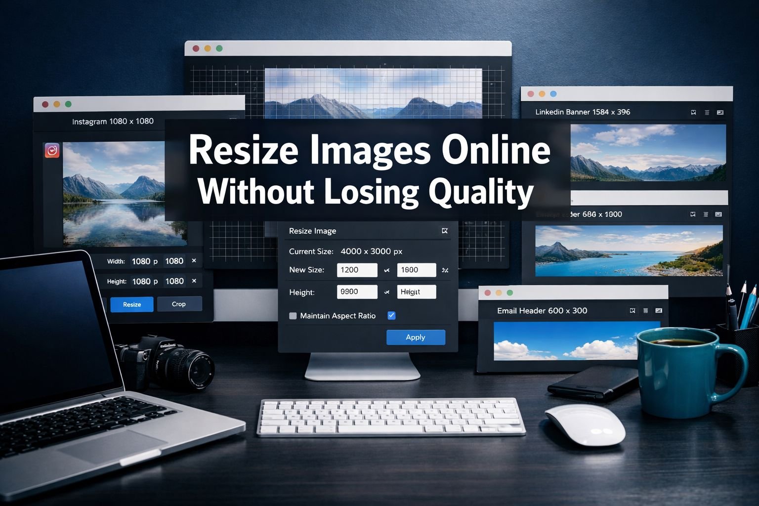
How to Resize an Image Online: Step-by-Step
This workflow works for any browser-based resizer, including the Core Tools Hub Image Resizer, which runs entirely in your browser with no sign-up and no file uploads to a server.
Step 1: Open the resizer tool. Go to the Image Resizer in any browser — Chrome, Edge, Firefox, or Safari on desktop or mobile.
Step 2: Upload your image. Click the upload area or drag your file in. Supported formats include JPG, PNG, WebP, and HEIC. Your file stays on your device; all processing happens in the browser.
Step 3: Enter your target dimensions. Type the width in pixels. If “lock aspect ratio” is enabled (it should be by default), the height adjusts automatically. This prevents stretching.
- For Instagram square: set width to 1080, height to 1080 (unlock aspect ratio only if the original is already square)
- For blog hero: set width to 1200, leave height auto
- For email header: set width to 600, leave height auto
Step 4: Choose your output format
- WebP: Best for web pages and social (smallest file, great quality)
- JPG: Best for photos going to platforms that don’t support WebP
- PNG: Best for logos, screenshots, or anything with a transparent background
Step 5: Set quality (if available). For JPG and WebP, a quality setting of 80–85% gives sharp results with significantly smaller files than 100%. Going below 70% introduces visible artifacts.
Step 6: Download and check. Download the resized image and open it at full size to check sharpness. If it looks soft, the original may have been too small to scale up cleanly.
Best settings quick reference:
| Goal | Width | Format | Quality |
|---|---|---|---|
| Instagram post | 1080px | JPG or WebP | 85% |
| Blog hero | 1200px | WebP | 82% |
| Email header | 600px | JPG | 80% |
| LinkedIn banner | 1584px | JPG | 85% |
| Product thumbnail | 500px | WebP | 80% |
When Should You Use JPG, PNG, or WebP After Resizing?
Choose the format based on what the image contains and where it’s going — not habit.
JPG is the right choice when:
- The image is a photograph with lots of colors and gradients
- The destination platform doesn’t support WebP (some older email clients)
- File size matters more than perfect edge sharpness
PNG is the right choice when:
- The image has a transparent background (logos, icons, stickers)
- You need pixel-perfect text or sharp edges (screenshots, diagrams)
- The image will be edited again later (PNG is lossless)
WebP is the right choice when:
- The image is going on a website or in a modern email client
- You want the smallest possible file without visible quality loss
- The platform supports it (all major browsers do as of 2026)
AVIF is worth considering when:
- You’re optimizing aggressively for page speed
- Your audience is on modern browsers (Chrome, Firefox, Edge, Safari all of which support AVIF now.
- You can use the Core Tools Hub AVIF Converter to convert from JPG or PNG
What about HEIC? If your images come from an iPhone, they’re likely in HEIC format. Most web platforms and email clients don’t support HEIC directly. Convert them to JPG or WebP first using the HEIC to JPG converter before resizing.
Decision rule: If the image is a photo going on a website, use WebP. If it has transparency, use PNG. If you’re sending it to someone who might open it in an older program, use JPG.
How to Prevent Blurry or Pixelated Images After Export
Sharp output after resizing depends on three things: starting image quality, correct downscaling (not upscaling), and choosing the right quality setting on export.
Checklist for sharp resized images:
- Start with the highest-resolution version of the image you have
- Always downscale (reduce size), not upscale (increase size)
- Lock the aspect ratio before entering dimensions
- Use a quality setting of 80–85% for JPG and WebP
- Save PNG as PNG (lossless) — don’t apply quality compression to PNG
- View the exported image at 100% zoom before publishing
- Check file size: if it’s still over your target, run it through a compressor
Common mistakes that cause blurry images:
- Upscaling a small image: A 300×300px image resized to 1200×1200px will always look soft. Start with a larger source file.
- Exporting JPG at a quality below 70%: Compression artifacts become visible, especially around text and edges.
- Using “Save for Web” in Canva at default settings: Canva’s default export often compresses more aggressively than needed. Export at the highest quality setting, then compress manually.
- Forgetting to check on mobile: An image that looks sharp on a desktop monitor may appear differently on a phone screen. Always preview on both.
Batch-Resizing Images: When You Have More Than One File
If you need to resize a folder of images — product photos, event shots, portfolio images — doing them one at a time is slow. Batch resizing applies the same dimensions and settings to multiple files at once.
Browser-based batch options:
- BulkResizePhotos.com runs entirely in the browser (client-side) and handles multiple files without uploads. Good for quick batches of 10–50 images.
- Squoosh.app (by Google) offers precise control over WebP and AVIF output with side-by-side quality comparison, though it processes one image at a time.
Desktop batch options for Windows:
- Microsoft PowerToys Image Resizer integrates directly into File Explorer. Right-click any selection of images, choose “Resize pictures,” and apply presets. All processing is local — no uploads, no internet required.
- IrfanView and FastStone Photo Resizer both offer multithreaded batch processing for large folders, with support for JPG, PNG, WebP, and more.
When to use desktop tools vs. browser tools:
| Scenario | Best option |
|---|---|
| 1–10 images, any device | Browser-based resizer |
| 50+ images on Windows | PowerToys or FastStone |
| Need WebP/AVIF output with quality preview | Squoosh.app |
| Privacy is critical, no uploads | Client-side browser tool or local desktop app |
| Need social media presets | Browser tool with preset library |
Privacy note: Upload-based tools (where your images go to a server) are convenient but mean your files leave your device. If you’re resizing sensitive images — client work, personal photos, confidential documents — use a client-side tool that processes everything in the browser. The Core Tools Hub Image Resizer is built this way: all processing happens in your browser, and no files are sent to any server.
How Resized Images Improve Website Speed and SEO
Correctly sized images are one of the highest-impact changes you can make to a slow website. Large, unoptimized images are a leading cause of poor Core Web Vitals scores, which Google uses as a ranking factor.
The two-step workflow for web-ready images:
- Resize to the correct pixel dimensions using a browser-based resizer
- Compress the output using an image compressor to reduce file size further without visible quality loss
This two-step process — resize first, then compress — consistently produces smaller files than either step alone. After resizing, use the Core Tools Hub Image Compressor to reduce the file size further.
Format matters for international audiences: WebP files are typically up to 30% smaller than JPG at comparable quality. For users on slower mobile connections — a significant portion of web traffic in many regions — that difference in file size translates directly into faster page loads and lower data costs.
Additional SEO steps after resizing:
- Use descriptive file names (e.g.,
instagram-post-resize-guide.webp, notIMG_4892.jpg) - Add alt text to every image in your CMS
- Remove EXIF metadata from images before publishing if privacy matters — the Image EXIF Remover strips location data and camera details in seconds
- Use
widthandheightattributes in your HTML<img>tags to prevent layout shift
Format conversion as part of the workflow: If your images are currently PNG or JPG and you want to switch to WebP for web use, you can convert and resize in one pass. The JPG to WebP converter and PNG to WebP converter both run in the browser with no uploads. Convert, then resize, or resize first — either order works.
Frequently Asked Questions
Q: Can I resize an image without losing quality? Yes, if you’re reducing (downscaling) the image. Shrinking a large image to a smaller size removes pixels in a controlled way, producing sharp results. Enlarging a small image (upscaling) always involves some quality loss because the tool has to invent pixel data that wasn’t there.
Q: What’s the best free tool to resize images online without uploading them? Tools that process files client-side (in your browser) are the best option for privacy and speed. The Core Tools Hub Image Resizer runs entirely in your browser — no uploads, no account, no installs. Squoosh.app and BulkResizePhotos.com are also fully client-side options.
Q: What pixel size should I use for Instagram in 2026? For Instagram feed posts, use 1080×1080px for square, 1080×1350px for portrait, and 1080×566px for landscape. For Stories and Reels, use 1080×1920px. Export as JPG at 85% quality, or as WebP if the platform supports it.
Q: Why does my image look blurry after I resize it in Canva? Canva applies its own compression when you export, and dragging image corners inside Canva doesn’t give you precise pixel control. Export your original image at maximum quality from Canva, then resize it using a dedicated tool with exact pixel dimensions.
Q: Should I resize images before or after compressing them? Resize first, then compress. Resizing to the correct dimensions removes a large amount of unnecessary pixel data. Compressing afterward further reduces the file size. Compressing before resizing can introduce artifacts that get worse when the image is then scaled.
Q: What’s the difference between DPI and pixel dimensions? Pixel dimensions (e.g., 1200×800px) control how large an image appears on screen. DPI (dots per inch) is a print setting that tells a printer how dense to pack those pixels on paper. For web and social media, DPI is irrelevant — only pixel dimensions matter.
Q: Is WebP better than JPG for web images? For most web use cases, yes. WebP produces files that are typically up to 30% smaller than JPG at comparable visual quality. All major browsers (Chrome, Firefox, Edge, Safari) support WebP as of 2026. The main exception is older email clients, which may not render WebP correctly — use JPG for email images when in doubt.
Q: How do I resize a batch of images at once online? BulkResizePhotos.com handles multiple files in the browser without uploading them to a server. For larger batches on Windows, Microsoft PowerToys Image Resizer is a free, local option that integrates with File Explorer. For Mac users, the built-in Preview app supports batch export with resizing.
Q: What file size should web images be? As a general guide: blog hero images under 200KB, social media posts under 500KB, email inline images under 150KB, and product thumbnails under 100KB. If your resized image exceeds these targets, run it through an image compressor.
Q: How do I resize an image for a LinkedIn banner? Set the pixel dimensions to 1584×396px. Export as JPG at 85% quality. LinkedIn crops profile banners on mobile, so keep important content (text, logos) centered and away from the edges.
Q: Can I resize and convert format at the same time? Yes. Many browser-based tools let you upload a JPG, set new dimensions, and download as WebP — all in one step. This is the most efficient workflow for web optimization. Use the Core Tools Hub Image Resizer to resize, and the format converters (like JPG to WebP) for format changes.
Q: Do I need to remove EXIF data from resized images? It depends on where you’re publishing. EXIF data can include GPS location, camera model, and date/time. Removing EXIF data from images published on public websites or social media is a good privacy practice. Use the Image EXIF Remover to strip this metadata before uploading.
Conclusion: Get Sharper, Faster Images Starting Now
Resizing images correctly isn’t complicated once you know the right dimensions for each platform, understand the difference between pixel size and DPI, and have a reliable tool that doesn’t compromise your privacy.
The practical workflow is straightforward:
- Start with the largest version of your image
- Resize to the correct pixel dimensions for your platform (use the tables above)
- Choose the right format (WebP for web, JPG for photos, PNG for transparency)
- Compress after resizing to hit your file size targets
- Check sharpness at 100% zoom before publishing
For a fast, private, no-install workflow, the Core Tools Hub Image Resizer handles JPG, PNG, WebP, and HEIC files directly in your browser. Follow up with the Image Compressor to reduce file size without visible loss of quality. Both tools run entirely in your browser — no uploads, no account required, and your files never leave your device.
If you’re working with other file types or need more tools, the full online image tools suite covers format conversion, EXIF removal, and more — all with the same privacy-first, browser-based approach.
Key Takeaways
- Always downscale (reduce) rather than upscale (enlarge) to maintain image quality
- Match pixel dimensions to the platform: 1080×1080px for Instagram, 1200px wide for blog images, 600px wide for email
- DPI only matters for print; screens use pixel dimensions only
- WebP is the best format for web images in 2026 — smaller files, same visual quality, supported by all major browsers
- Export JPG and WebP at 80–85% quality for the best balance of sharpness and file size
- Resize first, then compress — this two-step process produces the smallest files
- Use client-side (browser-based) tools to keep your images private — no server uploads needed
- Remove EXIF metadata from images before publishing to protect location and device data
- Batch tools like PowerToys (Windows) or BulkResizePhotos.com handle large image sets efficiently
- Correct image sizing directly improves website load speed and Core Web Vitals scores
Related reading:
- How to convert WebP to JPG in your browser
- Convert PNG to WebP for faster web images
- Convert HEIC photos from iPhone to JPG
- Compress images without visible quality loss
- Convert images to AVIF for maximum compression