90% of mobile pages still ship oversized images — a single stat that costs real visitors and revenue. We start there because small wins in image delivery drive big gains in speed, Core Web Vitals, and conversions.
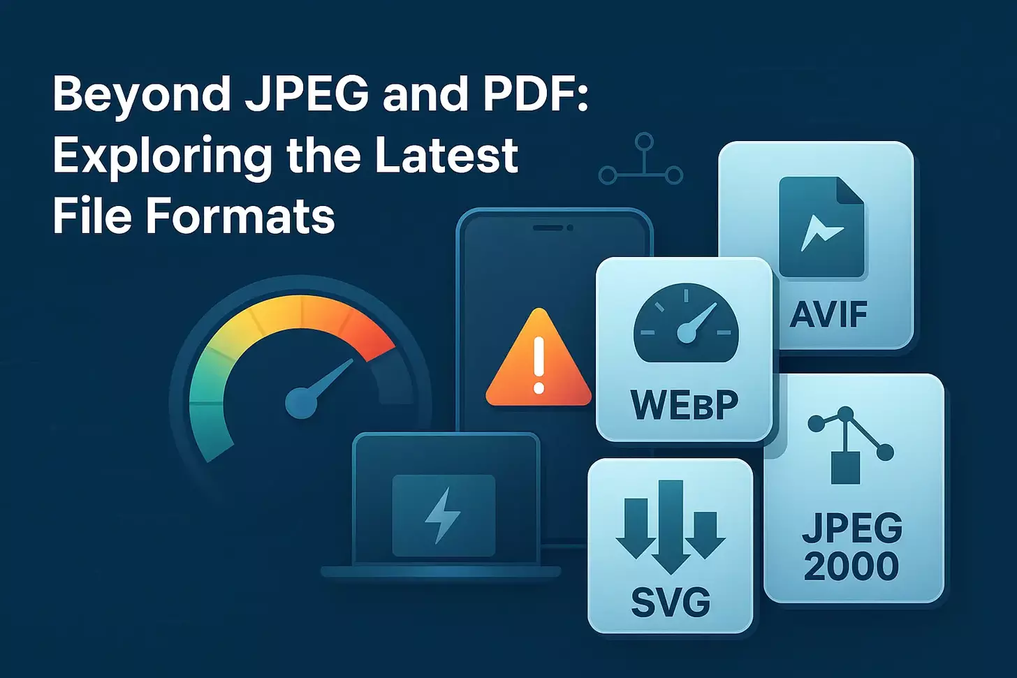
We unpack how modern options like WebP, AVIF, JPEG 2000, and SVG change the math for websites. These next-gen image formats squeeze bytes while keeping visual fidelity. That means faster loading on slow networks, lower bandwidth, and better page performance without sacrificing quality.
In practical terms, picking the correct image format matters for every step of the pipeline. We’ll show where each format wins — from vector logos to HDR photography — and how smart delivery and fallbacks protect the user experience. Our goal is simple: help teams deliver images that look great while cutting overhead across storage, delivery, and rendering.
Key Takeaways
- Modern image formats reduce file size and speed up page loading.
- AVIF and WebP offer significant compression gains with strong visual quality.
- SVG suits logos and icons because it scales without pixel loss.
- Choosing formats wisely improves Core Web Vitals and conversions.
- Plan fallbacks and encode pipelines to avoid broken images in browsers.
Why Next‑Gen Image Formats Matter Now for Performance, SEO, and UX
Heavy images are often the unseen cause of slow load times that drive visitors away. Large, unoptimized images inflate page size and harm website performance, especially on mobile. Users abandon sites that take too long to load, which hurts search rankings and conversions.
Using modern image options reduces bytes dramatically—WebP can be 25–34% smaller than JPEG and 22–50% smaller than PNG at similar image quality. That translates to better Largest Contentful Paint and faster perceived loading without sacrificing clarity.

How images affect speed, engagement, and rankings
- Pages load faster when key assets are smaller in size, improving LCP and user experience.
- Lower payloads reduce bounce rates and lift conversions for mobile users on limited bandwidth.
- Google signals in PageSpeed Insights favor smaller images and flag legacy assets for replacement.
- Prioritize hero images, product photos, and banners for the most significant gains in website performance.
Beyond Legacy: How Next‑Gen Formats Differ from JPEG, PNG, and PDF
More intelligent image engines enable teams to deliver crisp visuals with significantly fewer bytes. New codecs prioritize perceptual quality while reducing payload sizes, allowing the pages to load faster and enhancing the user experience on mobile networks.

More intelligent compression: balancing quality and file size
WebP offers both lossy and lossless modes and is often much smaller than JPEG or PNG without visible loss. AVIF usually compresses even better and supports HDR, though encoding takes longer and support varies across browsers.
Where traditional formats still fit in modern workflows
JPEG and PNG remain useful in design pipelines and as fallbacks served through the picture element. SVG is ideal for icons and logos since it scales without pixelation and is crawlable by search engines.
| Format | Strength | Best use |
|---|---|---|
| WebP | Lossy & lossless, small size | Photos, responsive images |
| AVIF | Superior compression, HDR support | High-quality galleries, long-term storage |
| JPEG 2000 | Progressive decode, safari-centric | Edge cases where Safari optimization matters |
| SVG | Vector, infinite scale, SEO-friendly | Logos, icons, animations |
| JPEG/PNG | Broad compatibility, design workflow | Fallbacks, archival masters |
We recommend a hybrid approach: use next-generation formats for delivery, retain legacy images for compatibility, and audit assets so that each image maps to the most efficient choice for your website.
Deep Dive into WebP: Lossy, Lossless, Transparency, and Animation
WebP packs advanced compression, transparency, and animation into a single, web-friendly container. It delivers roughly 25–34% smaller files than JPEG and 22–50% smaller than PNG at similar quality, which speeds loading for users on slow networks.
Compression gains and real‑world speed benefits
We translate those savings into lower bandwidth and faster rendering of hero images. A smaller file size means quicker LCP and fewer dropped visitors.
Browser support realities and fallback strategies
Most modern browsers support WebP, but legacy clients need fallbacks. Use the element to serve WebP with a JPEG fallback and protect older browser versions.
“Use width/height attributes, srcset/sizes, and lazy loading to reduce layout shift and avoid wasted downloads.”
Best use cases: fixed vs responsive images
Choose lossy for full‑bleed photos and lossless for icons with sharp edges. WebP also handles alpha and animation, replacing many PNGs and GIFs.
| Feature | Best use | Delivery tip |
|---|---|---|
| Lossy | Hero photos, galleries | cwebp quality 70–85; use srcset |
| Lossless + alpha | Logos, UI icons | Keep sharp edges; set width/height |
| Animation | Micro-interactions, banners | Replace GIFs with a smaller size |
For pipelines, use cwebp for scripting, Imagemin in CI, and Squoosh for visual checks. Finally, name files clearly, add descriptive alt text, and leverage caching to serve images fast on return visits.
AVIF Advancements: Efficiency, HDR, and When to Choose It
AVIF delivers striking quality at much smaller sizes, making it a go-to for photo-heavy pages and premium product imagery.
Based on the AV1 codec, AVIF often beats JPEG and sometimes WebP for file size while keeping visual fidelity. It supports HDR and alpha, so high‑dynamic scenes and transparent assets look exceptional.
Quality at smaller sizes: when AVIF outperforms WebP
AVIF shines on complex photos, hero banners, and high-density visuals. At a similar quality, it can reduce file size noticeably compared to WebP and JPEG. That helps with loading and lowers bandwidth without sacrificing perceived quality.
Current browser support and planning fallbacks
Support is growing—Chrome, Firefox, and Opera handle AVIF well; Safari is improving, but not universal. We recommend layering fallbacks: AVIF > webp > JPEG to cover most browsers and users.
“Start with AVIF for largest assets, AB-test vs. webp, and monitor render errors to keep the experience seamless.”
- Trade-offs: slower encoding and no progressive decode.
- Decision tips: prioritize by audience device mix, asset type, and caching lifetime.
Other Modern Options: JPEG 2000 and SVG in Your Stack
We recommend adding both a Safari‑centric codec and scalable vectors to round out delivery. Each fills a distinct role: one handles progressive raster decoding on Apple platforms, the other keeps UI elements crisp at any size.
JPEG 2000 supports lossy and lossless modes, plus progressive decode. It can compress better than JPEG and PNG in some cases, but encoding is slower and uses more RAM.
Adoption is limited across tools. That makes JPEG 2000 a fit for controlled environments or when Safari is a priority.
Serving pattern
- Detect Safari and serve JPEG 2000 where it benefits LCP.
- Default to AVIF or WebP for other browsers through content negotiation.
SVG as the vector complement
SVG scales without quality loss, is indexable, and supports CSS/JS animation. It excels for icons, logos, and illustrations, especially when kept simple and with minimal bytes.
Complex SVGs can bloat pages. We enforce optimization by minifying, stripping metadata, and setting performance budgets in the design system.
| Asset | Best use | Notes |
|---|---|---|
| JPEG 2000 | Safari hero images, progressive decode | High compression but limited tooling; serve conditionally |
| SVG | Icons, logos, UI illustrations | Indexable, animatable; optimize to avoid large payloads |
| AVIF/WebP | Photos, galleries | Default raster delivery for most browsers |
“Pair vectors for UI with AVIF or WebP for photos to balance clarity, flexibility, and speed.”
Practical tools: svgo for minification, CI checks for SVG size, and conditional server logic for Safari. We recommend a pattern library to enforce accessibility attributes and maintain consistent image assets across the website.
Lossy vs. Lossless Compression: Choosing the Right Approach
A smart compression strategy balances visual fidelity with the practical need to lower page weight.
Lossy lossless compression comes down to a simple trade. Lossy removes less noticeable data to achieve large reductions in file size. Lossless compression keeps every pixel and is reversible, but yields smaller savings.
When to preserve pixel-perfect quality vs. maximize savings
Use lossless compression for brand assets, detailed product photos, and images meant for zoom. Use lossy at moderate quality for fixed-dimension UI images, thumbnails, and decorative images where tiny artifacts don’t matter.
Avoiding overcompression and protecting visual fidelity.
- Guardrails: set minimum quality thresholds in pipelines to prevent extreme compression.
- QA checklist: Zoom tests, side-by-side comparisons, and stakeholder sign-off before release.
- Delivery tips: set correct intrinsic dimensions, use responsive srcset/sizes, and lazy load to cut payloads without harming quality.
Segment your library: higher compression for decorative assets, higher fidelity for commerce images: track conversions and returns to detect perceptual harm. Combine caching and CDNs to reduce transfers and keep your website fast for every user.
Beyond JPEG and PDF: Next-Gen File Formats Explained in Practice
We map how teams convert images at scale, automate CMS flows, and serve smarter assets to users. This practical guide focuses on tools that transform large libraries into efficient, reliable image delivery pipelines.
Converting at scale: command line and CI
Use cwebp for single-file or batch conversions with quality flags (for example, -q 50) and simple loop scripts to convert entire folders.
ImageMagick excels at scripted batch processing—resize, strip metadata, and output multiple sizes in one pass.
Integrate Imagemin with a WebP plugin into your build pipeline to automate conversions during CI/CD runs.
Squoosh.app is ideal for visual checks and quick A/B comparisons before rolling changes to production.
WordPress and CMS workflows
Plugins like WebP Express, ShortPixel, EWWW, and Smush (Pro) can automatically convert on upload and serve fallbacks when needed. That eliminates manual work and ensures the media library remains consistent.
CMS tooling also simplifies alt text, cropping, and creating responsive variants, resulting in SEO and UX wins.
Frontend delivery: frameworks and lazy loading
Next.js <Image> optimizes images automatically, supports lazy loading, blurred placeholders, and can emit WebP images to reduce CLS and speed page loading.
Responsive srcset plus sizes attributes let browsers pick the right size and lower bandwidth for mobile users.
Image CDNs: negotiation, resizing, and caching
Services such as Imgix and Cloudinary handle dynamic resizing, format negotiation (AVIF/WebP/JPEG), and global caching at the edge. They let us deliver images more efficiently and quickly without complex server logic.
“Start by converting hero templates first, validate quality, then roll out to archives—measure LCP and bandwidth to prove gains.”
| Workflow | Primary tools | Best outcome |
|---|---|---|
| Command-line bulk convert | cwebp, ImageMagick | Fast batch conversion with quality controls |
| Build automation | Imagemin, WebP plugin | CI-driven image optimization for every deploy |
| Visual QA | Squoosh.app | Side-by-side quality vs size checks |
| CMS auto-convert | WebP Express, ShortPixel, EWWW | Auto-convert on upload + fallbacks |
| Edge delivery | Imgix, Cloudinary | Format negotiation, resizing, and cached global delivery |
Serving Next‑Gen Images Reliably: Browser Support, Fallbacks, and SEO
We build delivery so every user receives a compatible, optimized image without extra complexity. That means combining HTML patterns, server rules, and light feature detection to serve images that improve page speed and reduce wasted bytes.
HTML5 picture element patterns with AVIF/WebP/JPEG fallbacks
Use the <picture> element to stack sources for WebP, AVIF first, then a broad-compatibility raster. Include a final <img> fallback with width/height, loading=”lazy”, and decoding=”async”.
.htaccess routing and content negotiation
On Apache, detect the Accept header and set MIME types. Example: AddType image/webp .webp. Add a Vary header so caches know that responses differ based on Accept. This lets servers automatically serve images that match a browser’s capabilities.
Modernizr and JavaScript detection for progressive enhancement
Use Modernizr checks for WebP variants (alpha, animation, lossless) to enable optional features without breaking the baseline. Fall back to standard img sources when scripts fail.
Alt text, filenames, and structured content for image SEO
Optimize filenames and write clear alt text to help discovery and accessibility. Use captions and structured markup where relevant. Finally, use responsive srcset/sizes so that small viewports receive images of a smaller size, resulting in faster page load times.
“Set intrinsic dimensions, lazy-load images, and serve the smallest compatible asset to boost website performance and protect layout stability.”
Conclusion
Good image strategy turns bulky media into measurable gains for speed, UX, and SEO.
We recommend using next-gen images like WebP and AVIF, where they cut bytes most—WebP often saves ~25–34% vs older rasters; AVIF can compress further while adding HDR support.
Pair raster choices with SVG for logos and set clear fallbacks via the <picture> element, .htaccess negotiation, and feature detection so every user gets a compatible image file.
Automate conversions in CI, use WordPress plugins or Next.js <Image>, and push delivery to an image CDN. These operational steps enhance Core Web Vitals, reduce storage and bandwidth usage, and increase engagement.
Start with high-impact pages, measure LCP and conversions, then scale a format policy across the website.